 To start off my magazine advert i decided to use the checkered theme that we having running through our music video with the spilt screens and the checkered theme that i have used in my album cover.

I then continued this checkered theme with smaller checkers so that the audience could draw the link between the album cover and the magazine advert.
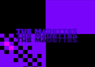 I then used the same font that i had used on the album cover and the same style of layout and colour that i had used for the band name and put it onto the center of the A5 advert. I decided to use the same idea for duplicating the name because i wanted to continue the dupliation idea with the pictures of the band.
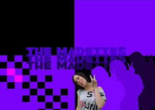
I then added a picture of a band member, where i first used the magic wand tool to edit large chunks of the background. However this didn't get me close enough to Stacey, so I then went on too use the magnetic lasso tool which allowed me to zoom into the pictures and cut the background out. After that I duplicated the picture of Stacey and used the colour overlay like Idid with the crowd on my album cover to create silhouettes. I decided to use purples as the colour as it tied in with the colour that I had previously used for the album cover and to background for this advert.
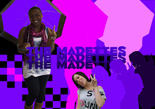 I then repeated the same process, with the second band member but started out using the magnetic lasso tool which saved me time. I then decided to continue the silhouettes idea but decided to use the colour pink to link with the random pink checkers that I have already used, i also feel that it made the silhouettes stand out.
 I decided to use a long shot picture of the 'main' singer in the advert and position the picture there because I didn't wanted the other picture of a band member to to be over shadowed by the checkers behind and as it was a mid shot pictures if I had expanded the picture the quality would have been distorted.

I finished off by putting in the album title and writing 'Debut album' so the audience knows that it is a new band and their first album, which I decided to use the same font as the album title so that there as a link with the album itself. I also put on institutional information such as the record label the dvd sign as the album is dvd compatible and the itunes logo so that the audience knows that it is available for download on itunes.
No comments:
Post a Comment