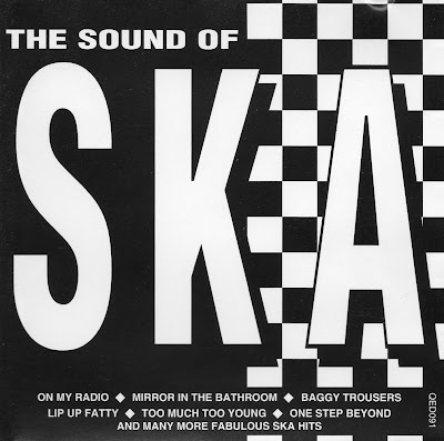

The first Ska album I decided to analyse, when researching into how I should do my album cover was 'The Sound of Ska'. I decided to analyse this album because it is an compilation album and therefore had to create an overall images for all of Ska. Just by looking at the album you can tell that black and white is a clear convention. I personally like the way that they use the checkers on the album as it is just at the side, therefore not dominating the album but still something that you notice and will remember from the album, which they have followed on to the back cover with the line of checkers used to divide the songs and the institutional information. However this album is quite boring and has nothing that draws you to it as it is only black and white, therefore I would like my cover to be colourful to go against the conventions, but still to include conventions like the checker idea.
No comments:
Post a Comment