Friday 26 February 2010

Re Shooting

We revisiting our music video we thought that the lighting and use of angles weren't good from the recording studio, so we decided to reshoot. to improve it we thought about lighting and decided to use a studio light.

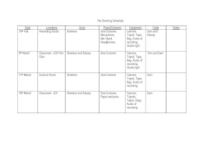
We used a screen for the background to make the setting look more professional. We also thought about Mise-En-Scene, which consisted of a microphone on a stand, the costume was casual everyday clothing to portray that she was relaxed as the band were recording, taking a modern twist on the clothing they wore with a big cardigan and checkered scarf.

Even though I was the one being filmed, asked to see the shot, by them flipping the screen round so that i could see it, so that we all agreed on the shot.

This time I feel that the way we filmed the main singer in the studio was better as:

-- We thought about lighting
-- Considered different angles
-- Considered different shot types
-- Also I was doing gestures, and looking into the camera so it looked as if i was talking directly to the audience.

However we will not be able to use this footage as the timing for the vocals are wrong (as we didn't have the song with us) and we cant slow down the clip to make it fit in time with the music. Therefore we are going to do this reshooting again, but before we do that we are going to get the song converted to an MP3 because it is a AIF at the moment, but as a MP3 we will be able to put it onto our phones so that we will also have it.

Reshooting

In this lesson my group got together and discussed when and what we need to do to improve our music video:

25th February: Film band members singing, walking down the corridoor of the school, use stop animation so they are shown in different areas of a classroom, whilst they are singing.

30th February: Film Club After School; Film the younger students in film club doing work and the band members will mess around and distract them also trying to include stop animation.


Thursday 25 February 2010

Shooting Schedule

After looking back on our music video and after getting audience feedback we decided that we need to do some re-shooting.

Audience Feedback


Photoshop; Finished Magazine Advert

Photoshop; Magazine Advert

To start off my magazine advert i decided to use the checkered theme that we having running through our music video with the spilt screens and the checkered theme that i have used in my album cover.


I then continued this checkered theme with smaller checkers so that the audience could draw the link between the album cover and the magazine advert.
I then used the same font that i had used on the album cover and the same style of layout and colour that i had used for the band name and put it onto the center of the A5 advert. I decided to use the same idea for duplicating the name because i wanted to continue the dupliation idea with the pictures of the band.


I then added a picture of a band member, where i first used the magic wand tool to edit large chunks of the background. However this didn't get me close enough to Stacey, so I then went on too use the magnetic lasso tool which allowed me to zoom into the pictures and cut the background out. After that I duplicated the picture of Stacey and used the colour overlay like Idid with the crowd on my album cover to create silhouettes. I decided to use purples as the colour as it tied in with the colour that I had previously used for the album cover and to background for this advert.

I then repeated the same process, with the second band member but started out using the magnetic lasso tool which saved me time. I then decided to continue the silhouettes idea but decided to use the colour pink to link with the random pink checkers that I have already used, i also feel that it made the silhouettes stand out.

I decided to use a long shot picture of the 'main' singer in the advert and position the picture there because I didn't wanted the other picture of a band member to to be over shadowed by the checkers behind and as it was a mid shot pictures if I had expanded the picture the quality would have been distorted.


I finished off by putting in the album title and writing 'Debut album' so the audience knows that it is a new band and their first album, which I decided to use the same font as the album title so that there as a link with the album itself. I also put on institutional information such as the record label the dvd sign as the album is dvd compatible and the itunes logo so that the audience knows that it is available for download on itunes.


Saturday 6 February 2010

Photoshop; Finished Inside


Photoshop; Creating The Inside Spine

For the inside cover I decided to use the same spine design as the outside, however I decided to take off the band name and DVD logo sign as it conventional for the band name and DVD logo to be shown in the inside of a album cover. I then used the stamp tool again and put a star where the DVD logo used to be.

UPLOAD PICTURE

Photoshop; Creating The Inside Left

To start to left inside of my album cover, I first decided to use a purple background and then put two lines of a crowd at the top, so that the inside, back and front cover all had a link. I then decided to use the shape tool and create a square under one side of the crowd to create a split screen effect, as it linked in with our music video.

To make sure that the squares were even I used a ruler tool to make sure that each square was the same size. I then opened a picture in Photoshop and used a magnetic lasso to cut out the background from a picture of myself, which I then repeated for a picture of Stacey. I then copied the picture onto the split screen canvas and resized it to fit into a square; I then repeated this for a picture of Stacey.

In the other squares I decided that I wanted to use them to introduce the band members with something that they might say. So I decided to use random song lyrics that would show the band members personality and would tie in with the ‘mad’ aspect of the band.

I then wrote the names of the band members in the same font as the title of the album, which I then placed on the middle line of the split screen, so that Stacey’s name was above the and my name was below, so the audience knows who is who.

I then used the stamp tool to add a pop/commercial feel to it. I did this by using a star vector which I then placed so it looked like it was coming out of my hand and arranged it around the lyrics and down towards Stacey. I used the colour pink against the purple background and black against the black background so the colours would stand out. I also included the mini checkers that I had used on the back cover.

Photoshop; Creating the Inside Right

On the inside right on the cover I used a black background and used the shape tool to create circles to show where the CD would be. I then used the colour fill to fill the circular space purple. I also used enlarged checkers so that the cover linked in with the plain in comparison to the left side of the cover.

I then edited the background of a picture of myself and Stacey, which we had taken using a tripod placed on a table, so it looked like the audience was looking down on us. This tied in with the Ska genre as bands such as ‘The Specials’ had lots of pictures were they were looking up and the camera or not at the camera at all. This idea has also been used with a Madness covers were they are not looking at the camera. The only difference that I used for my picture was that it was a close up.

I then put a gradient colour overlay on the picture, so you couldn’t see us and enlarged the picture so that it fit on the CD. However the picture then looked boxed so I enlarged it further so I then enlarged it further so that it was bigger then the CD outline and use the rubber tool to get rid of the part of the picture that over lapped the CD.

I then continued with the stars that I had done on the previous side and used pink on the black background and black on the purple CD section. I then using the same font as the album title put the album title on the CD layout and also included a website for the band on the bottom corner of the canvas.

UPLOAD PICTURES

Photoshop; Creating The Back

My back cover idea has changed from my initial idea as the idea of big checkers and pictures being in them looked to cluttered, and therefore I thought I would change it to a small section. To start the back I decided to continue the checker idea that I started on the spine and decided to be in a small section that wasn't perfectly shaped as I wanted it to follow the way the length of the songs words would be, which I would alter when I put in the wording on.

I then went on to do the institutional information, which included a bar-code and the record label 'Island' that I had chosen.

I then went onto add the song list, starting with 'Welcome to the MadHouse' which i had also named the album. I then chose songs that seemed fun and upbeat which would appeal to a young generation of people and an older generation as it would remind them of when they were younger and the Ska bands they used to listen to, such as Madness who had songs on their album called; 'Rainbows' and 'Bingo'.

I also added the the crowd in a smaller form in comparison to the front cover, to keep the connection between the front and back cover.

I then added a picture of Stacey the other band member on the back as she isn't on the front, this is because with the crowd on the front cover it can become to cluttered, and I am seen as the main band member and am seen in the music video more, and on Ska albums there is generally more then 4 members in a band, with the main singer in the middle at the front, so that is why I decided to focus on the main one.


Friday 5 February 2010

Photoshop; Finished Outside Cover

This is my finished DVD cover, which combined the back cover, spine and front cover for 'The Madettes' album Welcome to the MadHouse.


Thursday 4 February 2010

Photoshop; Creating the Spine

To create the spine i opened up a new canvas with a width of 1.3 and height of 18.3. First I started with a blank black background and then took the band title font that I used on the front album over which I copied and the pasted onto the spine canvas. I then had to rotate the writing and shrink it down to a suitable size and put it just off the centre.

I then used a checkered pattern (which I found on a royalty free website) and put it on the top of the spine canvas and then continued this pattern towards the writing. I then used the magic wand to alter the colours of the checkers from white and black to white, with a few pink and purple random squares.

I then added a crowd onto the spine under the band name, which I kept on the same line as the previous the front cover ones, just a smaller version of it. I then put on the institutional information such as the dvd logo.

UPLOAD PICTURES