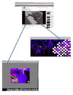
This is the finished product of my music video and for my image of the band I felt that 'Island' record label (not Stiff Records) would be better suited as it would appeal to the target audience more.
Tuesday 27 April 2010
Friday 23 April 2010
Evaluation; Question 4 Part 4
How did you use new media technologies in the construction and research, planning and evaluation stages?
Another media product that played a big part in creating my music video was Final Cut Express played an important role in the final editing process of my music video as this is where we edited the music video and used tools such as Chroma Key and Colour Corrector to make our music video accessible the our target audience. It also allowed us you use a layer system where our clips could be easily cut and allow us to make sure that the clips were all in sync, as well as changing the opacity of the clips so that the music video flowed. We were also able to use a colour matt were we could create small circles and squares on the screen that moved making the video more visually appealing.
Evaluation; Question 4 Part 3
How did you use new media technologies in the construction and research, planning and evaluation stages?
Another media technology that I used was a digital camera for my ancillary tasks and a video camera for my music video. I used the video camera and FIG-RIG which allowed me to create more interesting shots in our music video as the camera pans and circles the artist as they are in the music video, giving us a range of different shots and not just the same mid shot throughout the whole music video. I also used a digital still camera for my ancillary tasks where I used a tripod to capture pictures of the band members, using the tripod I was able to can a perfectly still shot and I was able to vary the shot type so I could have a long angle shots and high angle shots.
Evaluation; Question 4 Part 2
How did you use new media technologies in the construction and research, planning and evaluation stages?
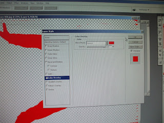
Another technology that I used was ‘Adobe Photoshop’ which helped me construct my ancillary task. This media product allowed me to create different layers allowing me to work separately on individual pictures so I can distort pictures and add effects such as an outer glow. Editing my pictures was achieved by using the magic wand and quick selection tools which allowed me to cut the background out the picture and any other parts from the picture that were unnecessary. This came in most helpful when I was creating the front of my alum cover as part of my ancillary task were I used the magic wand to cut out the background of someone dancing which then enabled me to use colour overlay successfully and put an outer glow on each individual picture, which created the crowd in the background.

Photoshop also allowed me to use the stamp and brush tool to make my ancillary tasks more interesting to the audience, through the use of stamps such as stars which I put around the song list on the back and on the inside of my album cover to so it looked like stars were coming out of my hand, creating a magical feel, which would appeal to the younger side of my target audience.
Evaluation; Question 4 Part 1
One technology that I used was the website blogger which I used to present my research, planning and details of my construction of my ancillary tasks and music video. The website was very effective as I was able to upload images and embed videos from YouTube making my blog more visual showing where I drew ideas from that was then used in my ancillary task or music video, though this could have been expanded on more if I put more of these visual aids onto my blog and went into a deeper critical analysis of them.
Through the use of Youtube I was able to watch other Ska genre bands such as 'Madness' were I found a song that they did called Ghost Train were they used silhouettes which I decided to use on my ancillary task.
Sunday 21 March 2010
Evaluation; Question 3 Part 2
What have you learned from your audience feedback?
Also form the feedback I learned that the audience wanted more interaction and to feel more involved with the music video. Which I felt we could do by adding the hustle and bustle that goes in around schools and as our music video was based around a school environment we felt this linked in. we also used stop motion animation in the music video were the band is in a classroom and the pupils are moving about in their seats and then the band members appear between them, helping our target audience feel involved as they are constantly looking at something different on the screen, so they are more focused and fixed on the music video.
Evaluation; Question 3 Part 1
What have you learned from your audience feedback?
As a group we felt that we should target teenagers from 14 to 18 year olds and decided to invite a group of our target audience to give us some audience feedback. We then input this data onto a table and used this information to make improvements on our music video, which included re-shoot and making it more colourful.
This session allowed us to gain an outside view on our music video and how we can make it more marketable to our target audience.
Evaluation; Question 2 Part 2
How effective is the combination of your main product and ancillary texts?
I was also able to combine the ancillary texts and main production together through the use of the checkered squares and split screen. Within my music video, split screen was used during the chorus and when you seen the main band member dancing in a classroom I translated these ideas onto my ancillary texts through the use of small checkered squares on the spine and back cover which I carried on into the inside.
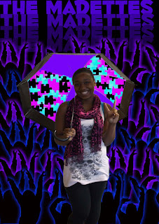
I also used a vector on Photoshop of jigsaw puzzles and use it on the umbrella that the main band member is holding, which I decided to use as there is a jigsaw puzzle in the music video which I translated on the ancillary task and used bright colours that are seen in the music video as a border as the band is playing.
I used the split screen effect on the inside cover which I used to introduce the band, by having one band member is opposite squares and then using the other squares to write something that the band member might say.
Evaluation; Question 2 Part 1
How effective is the combination of your main product and ancillary texts?
The use of a digital packs compilation allows me to focus on the band image and how they are portrayed on both the ancillary task and the music video. The combination of both was hard to achieve as the colours used within my music video are brighter and more colourful than the ones on my ancillary texts. I did this to make sure that the band image and colour would appeal to the older side of my target audience (18) and the younger side (14), through the use of bold pinks, purples and blues.
 I also chose to create crowd silhouettes in the background of the front cover, to make the audience picture themselves as the crowd and being at ‘the madettes’ concert which I drew from the idea of the video as the use of the school allowed the audience to relate and remember being at school and the fun they had at school and the crowd allowed them to think of the fun they will have at the concert.
Evaluation; Question 1 Part 3
In what ways does your media product use, develop or challenge forms and conventions of real media products?
My music video challenged the conventions of the Ska genre as unlike the Madness’ take on the music video we didn’t show the band performing as much, and focusing on the lyrics and how we could translate the words into movement and exact actions. By deciding on this idea we experimented with stop motion animation, which hasn’t been used in any of the Ska music videos, which has also developed the genre and giving it something new to expand on. We also developed on Madness’ idea of showing the actual school life though showing the hustle and bustle of everyone travelling between classes, which the audience can relate to doing as they travel between lessons.
Evaluation; Question 1 Part 2
In what ways does your media product use, develop or challenge forms and conventions of real media products?
My media product also challenges the conventions of Ska genre is through the image of the band. This is because the Ska 2 Tone genre was dominated my males and the mob-culture fashion of skin heads/ mod/ rude boy style 2 Tone fashion with other elements of late 1960s teen fashion as bands such as; ‘The Specials’, ‘Madness’ and ‘The Selector’ were on the scene. Whereas The Madettes were a female band therefore breaking the conventions whilst still appeal to a target audience through the use of girly colours such as mainly pinks and purples and blue, so that the band could be identified with by the audience, so they would want to imitate them and listen/buy their music. The use of a female band has developed the Ska genre as it has brought the Ska genre forward were ‘The Selector’ and ‘No Doubt’ started with a female lead singer and expanding it to a all female band, which pop/r&b artist have started to touch on, such as ‘Beyonce’ who uses a all female band, on tour and recording.
Evaluation; Question 1 Part 1
In what ways does your media product use, develop or challenge forms and conventions of real media products?
My media products (music video and ancillary tasks) use and develop forms of conventions, within Ska and the sub-genre of 2 Tone in different ways. My music video challenges forms and conventions of Ska 2 Tone, by modernising the Ska genre through the use of bright colours within the music video as the established colours in Ska music videos are black and white. The use of bright colour where continuously used throughout the music video which I used to exaggerate the idea of ‘The Madettes’ being mad, which also helps in modernising the genre and appeals to a younger target audience of 14-18 year olds. However I used forms of conventions within my music video through the use of checkered squares, split screens and images of the a band playing instruments, though this was not shown.
Monday 15 March 2010
Filming
For this filming session we decided to to stay after school to do all the filming that we needed to still do for our music video. We had previously organised a Cd with the song it so that we could play the song out loud and just focus on the filming, we also discussed areas in the school that still looked like a school to the audience.
We then decided that we would make it look as if myself and Stacey were meant to be doing work but were messing about instead talking to the audience. even though this was a good i the room didnt really lok like a classroom, but all other rooms that had more of the atmosphere we were going for were in use. We decided that we woud use more then one camera, one placed infront of us then one on more of a over the should shot, s that we would be able to cut between the two, making the scene more interesting.
We then decided to incoporate some more stop annimation, which we would put near the end of the music video, as we have atop motion at the begining odf the music video ut then do not carry this threw the whole music video.
Thursday 11 March 2010
Fliming
For this filming session we to use a free lesson that we had and go to a classroom, that had more of a classroom atmosphere such as diagrams on th walls and student work, so that the audience would associate the music video with a school setting.
We also experiemented with some more stop motion animation, and this time used a white board, (that teachers write on) and wrote baggy trousers on it. We also did a Mid shot and close up of me singing the song and used a panning shot fr the line al the kids have gone away' of an empty classroom.
We also experiemented with some more stop motion animation, and this time used a white board, (that teachers write on) and wrote baggy trousers on it. We also did a Mid shot and close up of me singing the song and used a panning shot fr the line al the kids have gone away' of an empty classroom.
Friday 26 February 2010
Re Shooting
We revisiting our music video we thought that the lighting and use of angles weren't good from the recording studio, so we decided to reshoot. to improve it we thought about lighting and decided to use a studio light.
This time I feel that the way we filmed the main singer in the studio was better as:
-- We thought about lighting
-- Considered different angles
-- Considered different shot types
-- Also I was doing gestures, and looking into the camera so it looked as if i was talking directly to the audience.
We used a screen for the background to make the setting look more professional. We also thought about Mise-En-Scene, which consisted of a microphone on a stand, the costume was casual everyday clothing to portray that she was relaxed as the band were recording, taking a modern twist on the clothing they wore with a big cardigan and checkered scarf.
Even though I was the one being filmed, asked to see the shot, by them flipping the screen round so that i could see it, so that we all agreed on the shot.
This time I feel that the way we filmed the main singer in the studio was better as:
-- We thought about lighting
-- Considered different angles
-- Considered different shot types
-- Also I was doing gestures, and looking into the camera so it looked as if i was talking directly to the audience.
However we will not be able to use this footage as the timing for the vocals are wrong (as we didn't have the song with us) and we cant slow down the clip to make it fit in time with the music. Therefore we are going to do this reshooting again, but before we do that we are going to get the song converted to an MP3 because it is a AIF at the moment, but as a MP3 we will be able to put it onto our phones so that we will also have it.
Reshooting
In this lesson my group got together and discussed when and what we need to do to improve our music video:
25th February: Film band members singing, walking down the corridoor of the school, use stop animation so they are shown in different areas of a classroom, whilst they are singing.
30th February: Film Club After School; Film the younger students in film club doing work and the band members will mess around and distract them also trying to include stop animation.
Thursday 25 February 2010
Shooting Schedule
After looking back on our music video and after getting audience feedback we decided that we need to do some re-shooting.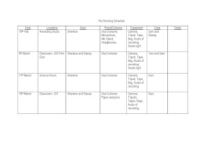


Photoshop; Magazine Advert
 To start off my magazine advert i decided to use the checkered theme that we having running through our music video with the spilt screens and the checkered theme that i have used in my album cover.
I then continued this checkered theme with smaller checkers so that the audience could draw the link between the album cover and the magazine advert.
 I then used the same font that i had used on the album cover and the same style of layout and colour that i had used for the band name and put it onto the center of the A5 advert. I decided to use the same idea for duplicating the name because i wanted to continue the dupliation idea with the pictures of the band.
I then added a picture of a band member, where i first used the magic wand tool to edit large chunks of the background. However this didn't get me close enough to Stacey, so I then went on too use the magnetic lasso tool which allowed me to zoom into the pictures and cut the background out. After that I duplicated the picture of Stacey and used the colour overlay like Idid with the crowd on my album cover to create silhouettes. I decided to use purples as the colour as it tied in with the colour that I had previously used for the album cover and to background for this advert.
 I then repeated the same process, with the second band member but started out using the magnetic lasso tool which saved me time. I then decided to continue the silhouettes idea but decided to use the colour pink to link with the random pink checkers that I have already used, i also feel that it made the silhouettes stand out.
 I decided to use a long shot picture of the 'main' singer in the advert and position the picture there because I didn't wanted the other picture of a band member to to be over shadowed by the checkers behind and as it was a mid shot pictures if I had expanded the picture the quality would have been distorted.

I finished off by putting in the album title and writing 'Debut album' so the audience knows that it is a new band and their first album, which I decided to use the same font as the album title so that there as a link with the album itself. I also put on institutional information such as the record label the dvd sign as the album is dvd compatible and the itunes logo so that the audience knows that it is available for download on itunes.
Saturday 6 February 2010

Photoshop; Creating The Inside Spine
For the inside cover I decided to use the same spine design as the outside, however I decided to take off the band name and DVD logo sign as it conventional for the band name and DVD logo to be shown in the inside of a album cover. I then used the stamp tool again and put a star where the DVD logo used to be.
UPLOAD PICTURE
Photoshop; Creating The Inside Left
To start to left inside of my album cover, I first decided to use a purple background and then put two lines of a crowd at the top, so that the inside, back and front cover all had a link. I then decided to use the shape tool and create a square under one side of the crowd to create a split screen effect, as it linked in with our music video.
To make sure that the squares were even I used a ruler tool to make sure that each square was the same size. I then opened a picture in Photoshop and used a magnetic lasso to cut out the background from a picture of myself, which I then repeated for a picture of Stacey. I then copied the picture onto the split screen canvas and resized it to fit into a square; I then repeated this for a picture of Stacey.
In the other squares I decided that I wanted to use them to introduce the band members with something that they might say. So I decided to use random song lyrics that would show the band members personality and would tie in with the ‘mad’ aspect of the band.
I then wrote the names of the band members in the same font as the title of the album, which I then placed on the middle line of the split screen, so that Stacey’s name was above the and my name was below, so the audience knows who is who.
I then used the stamp tool to add a pop/commercial feel to it. I did this by using a star vector which I then placed so it looked like it was coming out of my hand and arranged it around the lyrics and down towards Stacey. I used the colour pink against the purple background and black against the black background so the colours would stand out. I also included the mini checkers that I had used on the back cover.
Photoshop; Creating the Inside Right
On the inside right on the cover I used a black background and used the shape tool to create circles to show where the CD would be. I then used the colour fill to fill the circular space purple. I also used enlarged checkers so that the cover linked in with the plain in comparison to the left side of the cover.
I then edited the background of a picture of myself and Stacey, which we had taken using a tripod placed on a table, so it looked like the audience was looking down on us. This tied in with the Ska genre as bands such as ‘The Specials’ had lots of pictures were they were looking up and the camera or not at the camera at all. This idea has also been used with a Madness covers were they are not looking at the camera. The only difference that I used for my picture was that it was a close up.
I then put a gradient colour overlay on the picture, so you couldn’t see us and enlarged the picture so that it fit on the CD. However the picture then looked boxed so I enlarged it further so I then enlarged it further so that it was bigger then the CD outline and use the rubber tool to get rid of the part of the picture that over lapped the CD.
I then continued with the stars that I had done on the previous side and used pink on the black background and black on the purple CD section. I then using the same font as the album title put the album title on the CD layout and also included a website for the band on the bottom corner of the canvas.
UPLOAD PICTURES
Photoshop; Creating The Back
My back cover idea has changed from my initial idea as the idea of big checkers and pictures being in them looked to cluttered, and therefore I thought I would change it to a small section. To start the back I decided to continue the checker idea that I started on the spine and decided to be in a small section that wasn't perfectly shaped as I wanted it to follow the way the length of the songs words would be, which I would alter when I put in the wording on.
 I then went on to do the institutional information, which included a bar-code and the record label 'Island' that I had chosen.
 I then went onto add the song list, starting with 'Welcome to the MadHouse' which i had also named the album. I then chose songs that seemed fun and upbeat which would appeal to a young generation of people and an older generation as it would remind them of when they were younger and the Ska bands they used to listen to, such as Madness who had songs on their album called; 'Rainbows' and 'Bingo'.
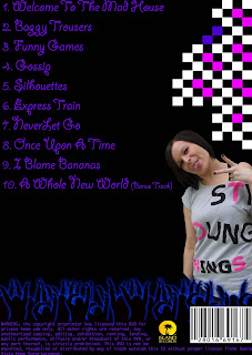
 I then added a picture of Stacey the other band member on the back as she isn't on the front, this is because with the crowd on the front cover it can become to cluttered, and I am seen as the main band member and am seen in the music video more, and on Ska albums there is generally more then 4 members in a band, with the main singer in the middle at the front, so that is why I decided to focus on the main one.
 I then went on to do the institutional information, which included a bar-code and the record label 'Island' that I had chosen.
 I then went onto add the song list, starting with 'Welcome to the MadHouse' which i had also named the album. I then chose songs that seemed fun and upbeat which would appeal to a young generation of people and an older generation as it would remind them of when they were younger and the Ska bands they used to listen to, such as Madness who had songs on their album called; 'Rainbows' and 'Bingo'.
I also added the the crowd in a smaller form in comparison to the front cover, to keep the connection between the front and back cover.
 I then added a picture of Stacey the other band member on the back as she isn't on the front, this is because with the crowd on the front cover it can become to cluttered, and I am seen as the main band member and am seen in the music video more, and on Ska albums there is generally more then 4 members in a band, with the main singer in the middle at the front, so that is why I decided to focus on the main one.
Friday 5 February 2010
Photoshop; Finished Outside Cover

This is my finished DVD cover, which combined the back cover, spine and front cover for 'The Madettes' album Welcome to the MadHouse.
Thursday 4 February 2010
Photoshop; Creating the Spine
To create the spine i opened up a new canvas with a width of 1.3 and height of 18.3. First I started with a blank black background and then took the band title font that I used on the front album over which I copied and the pasted onto the spine canvas. I then had to rotate the writing and shrink it down to a suitable size and put it just off the centre.
UPLOAD PICTURES
Wednesday 13 January 2010
Photoshop; Creating The Front Cover

To create my front cover I started with the artist name and put it at the top. I decided to use a similar font to 'The Specials' ..

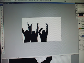
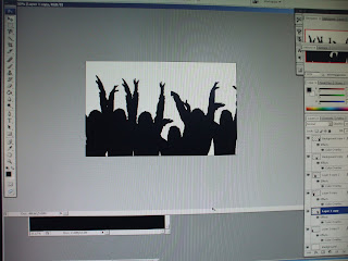
I then put in the crowd silhouettes that I created and just changed the outer glow between blue and a purple.
I then added a picture of the main singer form the band as there is already alot going on the cover so i decided to focus on the main singer from the band. it also goes against the conventions of Ska genre as the whole bad in normally shown on the album covers.

I then finished by adding the album title and for this used a different font as the first one i used ... is boring and thereofre doesnt get the idea across, so i chose a swiggly looking font for the ablum title called ...
Photoshop; Creating The Crowd
To create the background for my front and back cover of the DVD, I first took pictures of someone and used the magic wand and altered the tolerance, so that I could get rid of the background. I also used magnetic lasso to get a closer edge to the person to help create the prefect silhouette.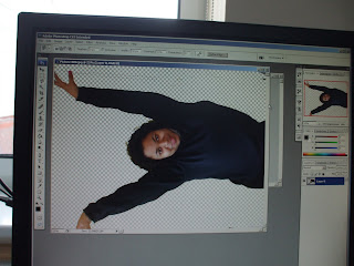
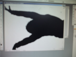

I then used a colour overlay effect, at a opacity of 100% and changed the colour to black to create a silhouette.
I then repeated this for a number of pictures, then free transformed them to be smaller and then copied them all onto a new sheet and then arranged the pictures to look like a crowd.
To finish it off I added a glow individually around each picture using the outer glow effect, on screen at 49% spread, I used a glow to make the crowd stand out as I wanted it to go on a black background to look like it was night and dark. I also chose a black background and dark blue's and purple was so that I can put a contrasting bright colour around the band. The bright colour is to resemble the madness of 'The Madettes'.

Saturday 9 January 2010
Research; Ska Covers; No Doubt
No Doubt is a modern version of Ska, they started in 1986 - present and during their career the band has won two Grammy Awards and has had sold 28 million records worldwide. The band broke traditional conventions of Ska as they entered the Ska Pop genre making they version of Ska more commercial. No Doubt also went against the checkered theme that Ska bands such as The Specials and The Selector, even the Ska ..albums used checkers on them.
This single cover that No Doubt has done places its main focus on Gwen Stefani the lad vocalist but they still hold on to the random element of Ska genre as Gwen is holding an orange, which doesn't link in with anything.
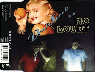 The other people on the cover are used to reinforce the song name 'Don't Speak'. However the people are shown speaking which can also relate to them going against the conventions.
The album cover also doesn't include checkers, and doesn't show any of the band members on the cover.
Also looking at a few other of their album covers you can see that the album covers have been influenced by the style of music they have been inspired by for the songs within the album, such as New wave, Dance Pop, Reggae and Dancehall.
Friday 8 January 2010
Research; Ska Covers


The album cover that i am going to textually analyse is The Speicals 1st album, as i am doing a debut compliation album for my band the madettes. This albu follows all conventions of Ska which are the black and white theme, a simple front cover as it only consists of just a white background and a picture of the band taken fom birds eye, which i plan to incorporate within my album. The band is also wearning sunglasses as the form of Ska came under New Wave and incorporated forms of mob-subculture, The band had begun wearing mod/rude boy/skinhead style two-tone tonic suits, along with other elements of late 1960s teen fashions.
The album however dosesn't follow album cover convetnions such as the song titles being on the back cover, as they are on the front as well as the record label. The album also includes simple font, and the song list suggests that it is amied at a more mature auience that the style of audience that i am going for with my band.
Research; Ska Covers


The first Ska album I decided to analyse, when researching into how I should do my album cover was 'The Sound of Ska'. I decided to analyse this album because it is an compilation album and therefore had to create an overall images for all of Ska. Just by looking at the album you can tell that black and white is a clear convention. I personally like the way that they use the checkers on the album as it is just at the side, therefore not dominating the album but still something that you notice and will remember from the album, which they have followed on to the back cover with the line of checkers used to divide the songs and the institutional information. However this album is quite boring and has nothing that draws you to it as it is only black and white, therefore I would like my cover to be colourful to go against the conventions, but still to include conventions like the checker idea.
Wednesday 6 January 2010
Re Do Of Cover Plan
I decided to change my cover plan as i felt it didn't link in with my music video or magazine ad enough and also wouldn't appeal to my target audience, so i drew upon the ideas that i had used on my magazine ad, making the cover more colourful and bright.


Record Label Choice
For my ancillary tasks i had to look into a record label for my band and for this i decided to choose Island Record label as it has artists like VV Brown on it, who i feel is a mordern day style of the Ska genre. I also decided to choose this label because the types of other artists on there appeal to the same target audience that i am aiming for such as the Sugababes, Justin Bieber and Rihanna.
Cover Research -- Jay Z
 During lesson we textually analysed Jay Z's most recent album cover 'The Blueprint 3' (shown on the left). We also looked at his previous album covers, to look at how his career focus changed, with his picture being in the for front or him being the main focus, to his most recent one, where he took it back to him being about the music, and how
 music is a form of art.

Looking into his album covers we saw how is the centre of attention, as that is how new artists start out, were the record label decides everything, were they used Jay Z's genre of Hip Hop and the Thug look, and close ups of him.
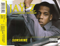
The close ups and Thuggish look makes to audience feel intimidated by him, but as Jay Z became more successful in his music career he came to have more say in the what he did and made it more about the music than him shown in the first picture of his most recent album cover.
Jay Z over time has become more noticed for his music than him, and has become a producer in his own right for himself and other artists. he has also collaborated with artists outside of his genre like; Linkin Park, showing that any genre can produce great music together as it is about the music and not the artist them self. Using Jay Z as a influence I want my band cover image to be more about the music, the artist is creating.
Editing;
In this session myself and Sam uploaded our footage began to edit the footage on Final Cut, using split screen again but with 3 screens a main one and to smaller ones.
On one of the small screens I used the clip were I run up to the camera and wave then run back, on this clip I added an echo effect which made it look mad as it left a trail. I then made the screen get bigger on the beat of the music, till it took over the whole screen, this added to the 'mad' idea and also keeps the audiences attention as the screen keeps changing.
Filming;
In a previous session we decided that we needed more clips of our artist, doing something mad to relate to the band name 'The Madettes'. For this filming session I decided that I would wear odd socks as it added to the 'mad' theme that we were going for.
So we decided to film the main artist (myself), first we decided to use a tripod and film me dancing on the tables, we thought this would b a good place as the classroom still relates to the school theme and dancing on tables is something that a pupil would not be doing. Sam then held to camera at low angle, were I ran up to the camera and waved at it, this makes the audience feel involved. We filmed me dancing several times were I did different 'funny' dance moves which a mature audience member can relate to and younger audience might laugh at.
Editing;
As a group we decided to add effects to our music video, to make it more appealing to a younger audience, whilst the choice of song appealed to a more mature audience. You use of colours and effects also relates to our band name of 'The Madettes'.
This music video breaks the conventions of Ska through the use of colour, as we have a moving colour sequence in our video which we did on Final Cut using the colour corrector tool. We also used a super imposition tool over me singing, to modernise our genre for today's audience.
Editing;
In this lesson we began to edit the second chorus within the song and for this we decided to use a split screen, showing four different clips at the same time.
This allows us to continue our theme of squares within the music video, as this would make it more interesting for the audience watching the video as it gives them choice of what to look at. This idea was also used in a Ska music video by The Selector.
Subscribe to:
Posts (Atom)