Wednesday, 13 January 2010

Photoshop; Creating The Front Cover


To create my front cover I started with the artist name and put it at the top. I decided to use a similar font to 'The Specials' ..
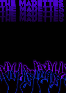
I then put in the crowd silhouettes that I created and just changed the outer glow between blue and a purple.
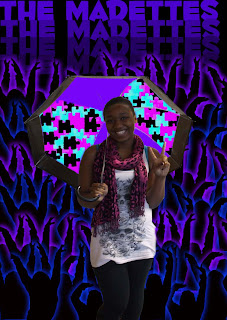
I then added a picture of the main singer form the band as there is already alot going on the cover so i decided to focus on the main singer from the band. it also goes against the conventions of Ska genre as the whole bad in normally shown on the album covers.


I then finished by adding the album title and for this used a different font as the first one i used ... is boring and thereofre doesnt get the idea across, so i chose a swiggly looking font for the ablum title called ...

Photoshop; Creating The Crowd

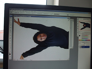
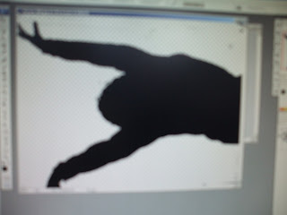
To create the background for my front and back cover of the DVD, I first took pictures of someone and used the magic wand and altered the tolerance, so that I could get rid of the background. I also used magnetic lasso to get a closer edge to the person to help create the prefect silhouette.


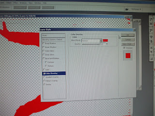
I then used a colour overlay effect, at a opacity of 100% and changed the colour to black to create a silhouette.


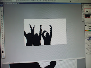
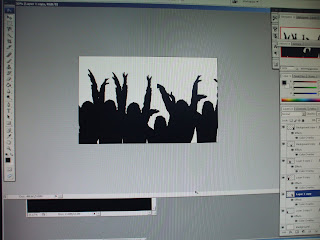
I then repeated this for a number of pictures, then free transformed them to be smaller and then copied them all onto a new sheet and then arranged the pictures to look like a crowd.


To finish it off I added a glow individually around each picture using the outer glow effect, on screen at 49% spread, I used a glow to make the crowd stand out as I wanted it to go on a black background to look like it was night and dark. I also chose a black background and dark blue's and purple was so that I can put a contrasting bright colour around the band. The bright colour is to resemble the madness of 'The Madettes'.


Saturday, 9 January 2010

Research; Ska Covers; No Doubt

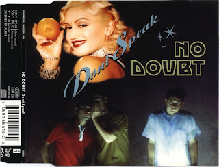
No Doubt is a modern version of Ska, they started in 1986 - present and during their career the band has won two Grammy Awards and has had sold 28 million records worldwide. The band broke traditional conventions of Ska as they entered the Ska Pop genre making they version of Ska more commercial. No Doubt also went against the checkered theme that Ska bands such as The Specials and The Selector, even the Ska ..albums used checkers on them.

This single cover that No Doubt has done places its main focus on Gwen Stefani the lad vocalist but they still hold on to the random element of Ska genre as Gwen is holding an orange, which doesn't link in with anything.

The other people on the cover are used to reinforce the song name 'Don't Speak'. However the people are shown speaking which can also relate to them going against the conventions.
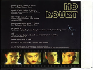
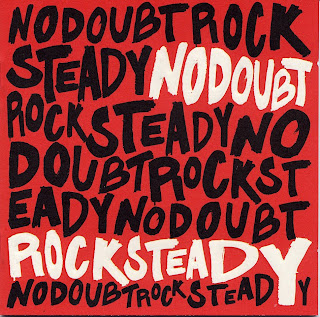

The album cover also doesn't include checkers, and doesn't show any of the band members on the cover.


Also looking at a few other of their album covers you can see that the album covers have been influenced by the style of music they have been inspired by for the songs within the album, such as New wave, Dance Pop, Reggae and Dancehall.

Friday, 8 January 2010

Research; Ska Covers


The album cover that i am going to textually analyse is The Speicals 1st album, as i am doing a debut compliation album for my band the madettes. This albu follows all conventions of Ska which are the black and white theme, a simple front cover as it only consists of just a white background and a picture of the band taken fom birds eye, which i plan to incorporate within my album. The band is also wearning sunglasses as the form of Ska came under New Wave and incorporated forms of mob-subculture, The band had begun wearing mod/rude boy/skinhead style two-tone tonic suits, along with other elements of late 1960s teen fashions.
The album however dosesn't follow album cover convetnions such as the song titles being on the back cover, as they are on the front as well as the record label. The album also includes simple font, and the song list suggests that it is amied at a more mature auience that the style of audience that i am going for with my band.

Research; Ska Covers


The first Ska album I decided to analyse, when researching into how I should do my album cover was 'The Sound of Ska'. I decided to analyse this album because it is an compilation album and therefore had to create an overall images for all of Ska. Just by looking at the album you can tell that black and white is a clear convention. I personally like the way that they use the checkers on the album as it is just at the side, therefore not dominating the album but still something that you notice and will remember from the album, which they have followed on to the back cover with the line of checkers used to divide the songs and the institutional information. However this album is quite boring and has nothing that draws you to it as it is only black and white, therefore I would like my cover to be colourful to go against the conventions, but still to include conventions like the checker idea.


Wednesday, 6 January 2010

Re Do Of Cover Plan

I decided to change my cover plan as i felt it didn't link in with my music video or magazine ad enough and also wouldn't appeal to my target audience, so i drew upon the ideas that i had used on my magazine ad, making the cover more colourful and bright.

Inside Cover Plan